I’ve been doing a lot of legacy schema reading lately, and one tiny difference between ERD tools keeps adding up.
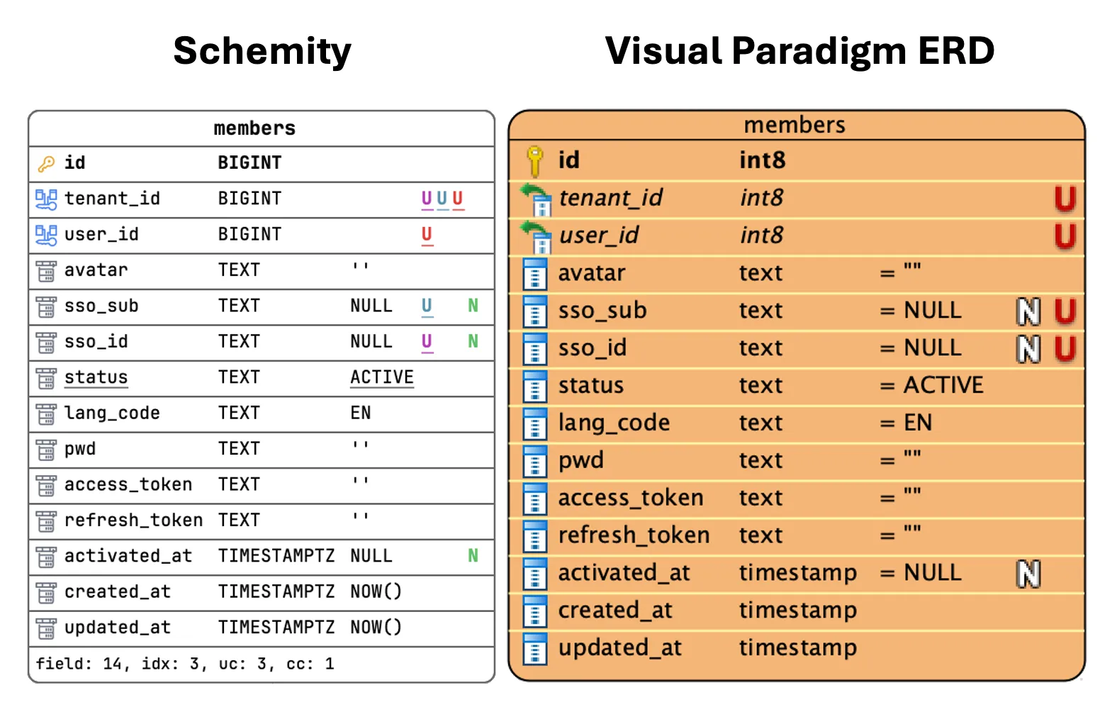
Here’s the same members table from a multi-tenant app, rendered two ways. It has three composite unique constraints, all anchored on tenant_id:
tenant_id+user_idtenant_id+sso_subtenant_id+sso_id
Both tools know about all three. They just don’t tell you about them the same way.
What Visual Paradigm shows
Four columns each get a red U. That’s it — same mark, same color. You learn that four columns participate in some unique constraint, but you can’t tell whether that’s:
- one four-column composite,
- four independent single-column uniques, or
- three overlapping pairs.
To find out, you open the constraint dialog and read the column lists one at a time. On a single table, fine — a minor annoyance. Across 80 tables in a legacy inspection, that’s a real tax. You spend the afternoon clicking through dialogs to reconstruct information the diagram could have just shown you.
What Schemity shows
Three colors, three constraints. The columns that belong to the same unique group share a color. tenant_id carries all three colors — instantly telling you it’s the anchor of every composite — and each of the three partner columns wears exactly the color of the constraint it pairs with.
No dialog. No clicking. You glance at the entity and you know the rule.
Why I keep coming back to this
When you’re reading an unfamiliar schema, the diagram is supposed to be the summary — the thing that lets you skip reading the DDL. The moment you have to open a dialog to disambiguate what a glyph means, the diagram has stopped doing its job.
A red U answers “is this column unique?” A colored membership answers “which uniqueness, and with whom?” Most of the time, the second question is the one you actually had.
It’s a small notation choice. But small notation choices, compounded across a whole legacy audit, are the difference between a tool that documents the schema and a tool that explains it.